The goals of this assignment is to differentiate between levels of measurement as well as classification methods, retrieving data from the U.S. census and joining data, and enhancing cartographic knowledge.
Part 1
For part one of this assignment, I will be defining, in my own words, commonly used levels of measurement including: Nominal, Ordinal, Interval and Ratio Data. Each definition I create will be paired up with a map that represents that level of measurement which will help to relate it to my definition.
Nominal: One way to think of nominal data is name data, or labels like color, names of cities, or sex. This type of data is used to differentiate between categories and there is never overlapping in data. Also, there is not any numeric value with type of data. Figure 1 is an example of a nominal data map because there are not any numbers listed on the legend, simply just names listed to show the different sectors for each European country.
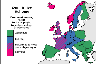 |
| Figure 1: A Map Representing Nominal Data |
 |
| Figure 2: A Map Representing Ordinal Data |
Interval: Interval data is infinite which means it can technically extend on forever because there isn't a natural zero. However, there are set 'zero' points on graphs that are used as references when observing data. A good example of an interval map would be of temperature or elevation. Figure 3 shows the elevation of Afghanistan.
 |
| Figure 3: A Map Representing Interval Data |
 |
| Figure 4: A Map Representing Ratio Data |
Part 2
For part two of this assignment, I will be creating three different maps to show which would be the best county in the state of Wisconsin to increase the number of USDA Certified Organic Farms. To complete this task, I will download data from the 2012 Census of Agriculture and use it to design maps classified as an Equal Interval Based on Range, Quantile, and Natural Breaks. Each map will include a brief definition of what these classifications mean. Finally, after analyzing each map, I will come to the conclusion on which map would be the most accurate in deciding which counties should increase more farms.
Equal Interval Based on Range: Equal interval means equal amount of range between each data class. This classification just divides classes up equally so some classes might have a lot of data, where others may not have any at all. As you can see from the map of Figure 5, each of the four data classes have an equal range of 58.24.
 |
| Figure 5: Map of USDA Organic Farms per County Using the Equal Interval Classification |
Quantile: For the quantile classification, the range of the classes aren't equal but the amount of data or observations will be equal for each class. This could leave one class with a huge range and another with a very small range. For example, the first data class has a range of 4 and the fourth data class has a range of 212.9 on Figure 6.
 |
| Figure 6: Map of USDA Organic Farms per County Using the Quantile Classification |
Natural Breaks: This classification method is a little different than the previous two because the person who creates the map can determine where the breaks are depending on differences between observations. A person can choose where they place the breaks, or the computer program can also choose where the breaks go as well. The classes in Figure 7 are divided more appropriately with this type of data.
 |
| Figure 7: Map of USDA Organic Farms per County Using the Natural Breaks Classification |
Conclusion: By analyzing each of the maps, I think that the map representing the data through the Natural Breaks method would be the best at showing which counties in Wisconsin should increase more USDA Certified Organic Farms. The classes for Equal Interval have too large of a range to really know which counties have very few or zero farms in them because the first class goes up to 58 farms.The map representing the Quantile method is better but the range of the classes differ too much in size and are misleading to once again understand which counties should increase more farms. The second class goes up to only 9 farms which is still a low enough number of farms per county to consider increasing more farms.The Natural Breaks method is best for looking at which counties should increase more farms because the breaks between classes are in the right spots to represent the amount of counties that do have the least amount of farms in them. By looking back at Figure 7, the map shows that the counties of northern Wisconsin and central Wisconsin could increase more USDA Certified Organic Farms.
Sources:
Figure 1 - https://web.natur.cuni.cz/~langhamr/lectures/vtfg1/mapinfo_2/barvy/colors.html
Figure 2 - https://www.usatoday.com/story/news/nation-now/2015/02/19/gallup-west-virginia-well- being-index-alaska/23608805/
Figure 3 - http://www.mappery.com/map-of/Afghanistan-Elevation-Map
Figure 4 - http://ninjurl.us/population-density-map-of-the-us.html
Census of Agriculture: 2010 SF1 Census Data